Friday, May 10, 2013
IMED Spring 2013
This Spring 2013, one of the classes I took was IMED with Professor Ghosh. I learned so much in this course because it challenged me in ways which I had not been before. Making the website was definitely the hardest part of this class because I had never done something like it. I was used to editing pictures or just making a basic spreadsheet, but the website recquired steps which I was not used to. I also liked making the poster because of how I got to use my initial design to represent a point to the judges during my Capstone presentation. Overall, this was a great class to take and I thoroughly enjoyed it.

Video
When I heard about making a video, I wanted to do a "How to" video since it was the easiest, but after I had made it and edited it, I learned that it had to be a video pertaining to something from Richland Collegiate High School. The video was meant to be used for the video yearbook, but I didn't know that. Since I had already made a video, I didn't feel like making a brand new one because of how hard I had worked on the last one.
Website
Making the website has been the hardest thing I've done in a photoshop class yet. It was hard for me to grasp the concept of doing the steps in a certain order. I kept messing up on when to do certain things, but in the end, my website turned out pretty well. I like how there are different layers to the screen and the color scheme that I chose. It's a great representation of my company layout that I have planned and it will effectively demonstrate my project to the judges.
Poster
While making a poster for Capstone, I learned that it was a lot harder to make a great poster than previously thought. I thought that you could use Paint and get the same quality products as Photoshop. It was actually difficult and challenging to make a product that was worth presenting to the judges. The best part of making the poster was knowing that I would get to use a laminated copy at the end for my overall project.
Here is the poster I used for inspiration.

Here is the poster I used for inspiration.
Thursday, January 17, 2013
My Logo

Logo that I like

Wednesday, January 16, 2013


Tuesday, January 15, 2013
Yearbook Cover Design

Friday, January 11, 2013
Yearbook title


Monday, January 7, 2013
My Three Words for 2013
Time- Managing and using my time wisely is a struggle and has been for the past few years. This year I would like to plan out my schedule a lot more in depth, because I feel like I under or over-book myself a lot.
Understand- I want to minor is psychology or sociology so I would like to take time out this year to learn more about others and why they do the things they do. I realize that not everyone is the same as me, and I have to slow down to judge someone. I want to try and see things from others' views.
Health- This year I plan on cutting out soda and limiting myself to junk food. I realize that my body is not a garbage can and I can't just fill it with whatever I want to.
Understand- I want to minor is psychology or sociology so I would like to take time out this year to learn more about others and why they do the things they do. I realize that not everyone is the same as me, and I have to slow down to judge someone. I want to try and see things from others' views.
Health- This year I plan on cutting out soda and limiting myself to junk food. I realize that my body is not a garbage can and I can't just fill it with whatever I want to.
1st assignment
Symmetrical Balance (not rule of thirds)

http://www.google.com/imgres?q=symmetrical&start=133&um=1&hl=en&client=safari&sa=N&rls=en&biw=1024&bih=1102&addh=36&tbm=isch&tbnid=MChKGcSbUjztlM:&imgrefurl=http://flacpagroup.com/sc-symmetrical-coloring-pages.html&docid=RzXOt_iJ5JSUnM&imgurl=http://coloringinpages.com/img/mandala-coloring-in-pages-12.gif&w=576&h=560&ei=yE8pUOOMN6HBygHgloHoBg&zoom=1&iact=hc&vpx=104&vpy=212&dur=1922&hovh=221&hovw=228&tx=170&ty=143&sig=105499084406214339708&page=6&tbnh=151&tbnw=155&ndsp=30&ved=1t:429,r:5,s:133,i:198
Asymmetrical Balance (has rule of thirds)

http://www.google.com/imgres?q=asymmetrical+balance&hl=en&client=safari&sa=X&rls=en&biw=1024&bih=1102&tbm=isch&prmd=imvns&tbnid=vWXJScZVPpWN7M:&imgrefurl=http://www.gatlineducation.com/demo/ResInteriorDesign/html/L11/L11CH02P02.html&docid=MvLI43ZyDqiDyM&imgurl=http://www.gatlineducation.com/demo/ResInteriorDesign/images/L11-03.jpg&w=417&h=243&ei=iVApUNTyGMTAyAHa8YGwBQ&zoom=1&iact=hc&vpx=107&vpy=168&dur=728&hovh=171&hovw=294&tx=210&ty=71&sig=105499084406214339708&page=4&tbnh=133&tbnw=228&start=71&ndsp=24&ved=1t:429,r:0,s:71,i:375
Radial Balance(has rule of thirds)
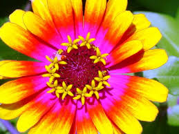
http://www.google.com/imgres?q=radial+balance&hl=en&client=safari&sa=X&rls=en&biw=1024&bih=1102&tbm=isch&prmd=imvns&tbnid=LUlhV_-IaLvaLM:&imgrefurl=http://pebrant.wordpress.com/2008/10/14/images-of-the-principles-of-design/&docid=GR_G07ja8oeUkM&imgurl=http://pebrant.files.wordpress.com/2008/12/balance.jpg&w=500&h=375&ei=1lApUKe9OMfuyAGkxoGYBg&zoom=1&iact=hc&vpx=130&vpy=261&dur=7933&hovh=194&hovw=259&tx=210&ty=94&sig=105499084406214339708&page=1&tbnh=161&tbnw=238&start=0&ndsp=22&ved=1t:429,r:14,s:0,i:186
Rule of Thirds Balance

http://www.google.com/imgres?hl=en&client=firefox-a&hs=lub&sa=X&tbo=d&rls=org.mozilla:en-US:official&channel=fflb&biw=2048&bih=1008&tbm=isch&tbnid=ANJEW-PuqRYPcM:&imgrefurl=http://www.phlib.co.uk/blogs/news%3Fpage%3D3&docid=GhNSghIMOgthlM&imgurl=http://cdn.shopify.com/s/files/1/0049/3892/files/RuleOfThirds-11_grande.jpg%253F100227&w=600&h=430&ei=s_zqUIWaCdTrqAGv-YFY&zoom=1&iact=hc&vpx=1742&vpy=422&dur=553&hovh=190&hovw=265&tx=175&ty=134&sig=116315184664174885429&page=2&tbnh=141&tbnw=193&start=56&ndsp=68&ved=1t:429,r:65,s:0,i:359
http://www.google.com/imgres?q=symmetrical&start=133&um=1&hl=en&client=safari&sa=N&rls=en&biw=1024&bih=1102&addh=36&tbm=isch&tbnid=MChKGcSbUjztlM:&imgrefurl=http://flacpagroup.com/sc-symmetrical-coloring-pages.html&docid=RzXOt_iJ5JSUnM&imgurl=http://coloringinpages.com/img/mandala-coloring-in-pages-12.gif&w=576&h=560&ei=yE8pUOOMN6HBygHgloHoBg&zoom=1&iact=hc&vpx=104&vpy=212&dur=1922&hovh=221&hovw=228&tx=170&ty=143&sig=105499084406214339708&page=6&tbnh=151&tbnw=155&ndsp=30&ved=1t:429,r:5,s:133,i:198
Asymmetrical Balance (has rule of thirds)
http://www.google.com/imgres?q=asymmetrical+balance&hl=en&client=safari&sa=X&rls=en&biw=1024&bih=1102&tbm=isch&prmd=imvns&tbnid=vWXJScZVPpWN7M:&imgrefurl=http://www.gatlineducation.com/demo/ResInteriorDesign/html/L11/L11CH02P02.html&docid=MvLI43ZyDqiDyM&imgurl=http://www.gatlineducation.com/demo/ResInteriorDesign/images/L11-03.jpg&w=417&h=243&ei=iVApUNTyGMTAyAHa8YGwBQ&zoom=1&iact=hc&vpx=107&vpy=168&dur=728&hovh=171&hovw=294&tx=210&ty=71&sig=105499084406214339708&page=4&tbnh=133&tbnw=228&start=71&ndsp=24&ved=1t:429,r:0,s:71,i:375
Radial Balance(has rule of thirds)
http://www.google.com/imgres?q=radial+balance&hl=en&client=safari&sa=X&rls=en&biw=1024&bih=1102&tbm=isch&prmd=imvns&tbnid=LUlhV_-IaLvaLM:&imgrefurl=http://pebrant.wordpress.com/2008/10/14/images-of-the-principles-of-design/&docid=GR_G07ja8oeUkM&imgurl=http://pebrant.files.wordpress.com/2008/12/balance.jpg&w=500&h=375&ei=1lApUKe9OMfuyAGkxoGYBg&zoom=1&iact=hc&vpx=130&vpy=261&dur=7933&hovh=194&hovw=259&tx=210&ty=94&sig=105499084406214339708&page=1&tbnh=161&tbnw=238&start=0&ndsp=22&ved=1t:429,r:14,s:0,i:186
Rule of Thirds Balance
http://www.google.com/imgres?hl=en&client=firefox-a&hs=lub&sa=X&tbo=d&rls=org.mozilla:en-US:official&channel=fflb&biw=2048&bih=1008&tbm=isch&tbnid=ANJEW-PuqRYPcM:&imgrefurl=http://www.phlib.co.uk/blogs/news%3Fpage%3D3&docid=GhNSghIMOgthlM&imgurl=http://cdn.shopify.com/s/files/1/0049/3892/files/RuleOfThirds-11_grande.jpg%253F100227&w=600&h=430&ei=s_zqUIWaCdTrqAGv-YFY&zoom=1&iact=hc&vpx=1742&vpy=422&dur=553&hovh=190&hovw=265&tx=175&ty=134&sig=116315184664174885429&page=2&tbnh=141&tbnw=193&start=56&ndsp=68&ved=1t:429,r:65,s:0,i:359
Friday, November 9, 2012
Website pages
GOOD WEBSITE INSTRUCTIONS:
http://www.sonicseo.com/good-site-elements/
http://www.smashingmagazine.com/web-design-essentials-examples-and-best-practices/
http://terrymorris.net/bestpractices/
http://designertoday.com/articles/6464/best.practices.for.website.design.aspx
http://designmodo.com/responsive-design-examples/
All these websites were basically saying to keep all the information on the page organized effectively and simply. There should not be too much flashy designs.
Favorite Websites:
1. MYSPACE
2. Twitter
3. Facebook
4. Instagram
5. Youtube
6. Wanelo
I keep going back to them because it's a way to connect with people without taking out your phone or actually seeing them.
Worst Website:
http://bavarianbrathaus.info/
http://sa.onenation.com.au/
Best Websites:
http://madewithover.com/
http://www.beatboxacademy.ca/
http://www.sonicseo.com/good-site-elements/
http://www.smashingmagazine.com/web-design-essentials-examples-and-best-practices/
http://terrymorris.net/bestpractices/
http://designertoday.com/articles/6464/best.practices.for.website.design.aspx
http://designmodo.com/responsive-design-examples/
All these websites were basically saying to keep all the information on the page organized effectively and simply. There should not be too much flashy designs.
Favorite Websites:
1. MYSPACE
2. Twitter
3. Facebook
4. Instagram
5. Youtube
6. Wanelo
I keep going back to them because it's a way to connect with people without taking out your phone or actually seeing them.
Worst Website:
http://bavarianbrathaus.info/
http://sa.onenation.com.au/
Best Websites:
http://madewithover.com/
http://www.beatboxacademy.ca/
Monday, November 5, 2012

Monday, October 29, 2012

Monday, October 8, 2012
How To Video: Pizza
http://vimeo.com/50984973
In this video, I tried to make it like a silent film for the last half, and I was going for the "Charlie Chaplin-esque"feel. I had the help of my two cousins, justin and Ashley, and Angel Roa also helped me with editing.
In this video, I tried to make it like a silent film for the last half, and I was going for the "Charlie Chaplin-esque"feel. I had the help of my two cousins, justin and Ashley, and Angel Roa also helped me with editing.
Monday, September 24, 2012
Animated or Video
I fee like in this day and age, the animated videos work more effectively. The updated media types capture the attention of the younger audience more efficiently, and allow the mind to explore in non-traditional ways. The traditional videos may seem more professional, but making animated videos and using them effectively demonstrate that you can work with updated procedures and that you're willing to do what you need to do in order to transmit the message to the selected audience.
Friday, September 21, 2012
Group Video: Dora and Diego
https://vimeo.com/49777726
Dora is pregnant and craving cupcakes. Unfortunately, Diego has eaten the last one. Diego explains that there is a cupcake oasis nearby, and the map appears to give directions. However, the map provides very misleading directions, leaving Dora and Diego confused. Dora happens to see the cupcake oasis a little ways off in the distance. She heads of to the oasis and Diego follows behind.
I helped with this video by filming and helping edit some clips.
Dora is pregnant and craving cupcakes. Unfortunately, Diego has eaten the last one. Diego explains that there is a cupcake oasis nearby, and the map appears to give directions. However, the map provides very misleading directions, leaving Dora and Diego confused. Dora happens to see the cupcake oasis a little ways off in the distance. She heads of to the oasis and Diego follows behind.
I helped with this video by filming and helping edit some clips.
Subscribe to:
Posts (Atom)